Organization of data analysis & visualization module
In the data analysis module, the view is split into 2 fields: Basic filters (top) and Infographics (bottom). The data visualized in the Infographics field can be filtered to only display a data subset by using filters at the top of the screen. Below is the description of the structures of those two main modules.
Basic filters field
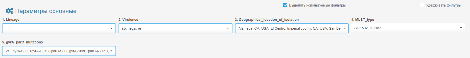
The metadata from your dataset that you’ve selected for loading will appear at the top of the screen as a set of filters with drop-down lists. The names of the filters originate from the column titles in your dataset (and likely differ from this manual, depending on your data). The same goes for the categories in the drop-down lists.
There are 2 types of data filters:
- Categorical filters have a drop-down to select from a list of values for filtering (E.g., geographical location, genes present, etc.).
- Continuous filters (e.g., age, date) are adjusted by sliding a bar on the scale to limit the value range.
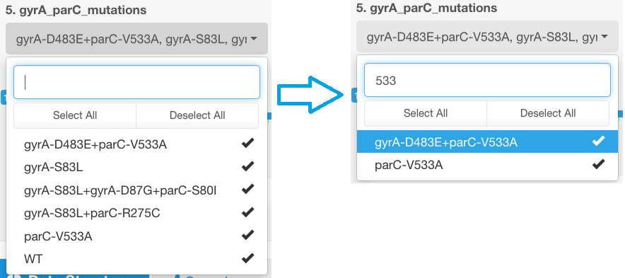
For easy selection of the parameters in the categorical filters, there is an option to start typing the text you would like to filter the data by, and this will show you all options containing the given text:
Hierarchical sorting principle
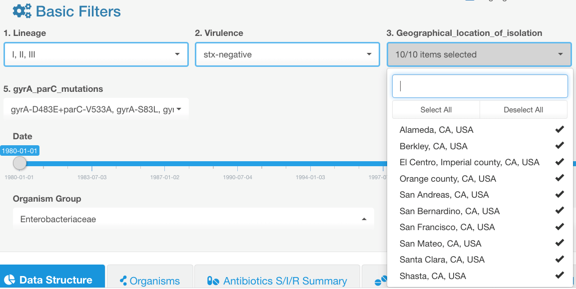
Parameters to which the filtering has been applied are marked with a blue box around the corresponding filter drop-down list. Filters are numbered according to their level in the filtering hierarchy (1-12, the lower the number, the higher the hierarchy). When applying the filtering to one of the categories at a higher level, the available filtering options for other lower-level categories may become limited due to filtering applied at a higher-level filter (this is also displayed as a blue box around affected filters).
If you change a higher-level filter, the lower-level filters will be reset.
Example
- Filter was applied to category 1.
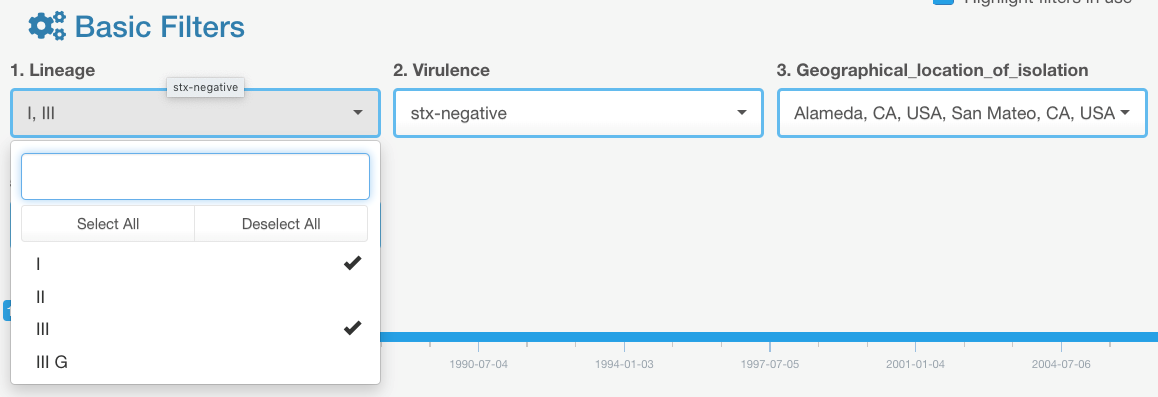
- After that, the data selection was filtered in category filter #3 to display only 2 geographical locations from the available list:
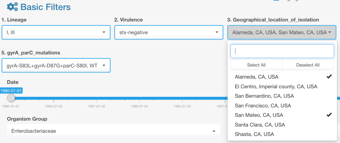
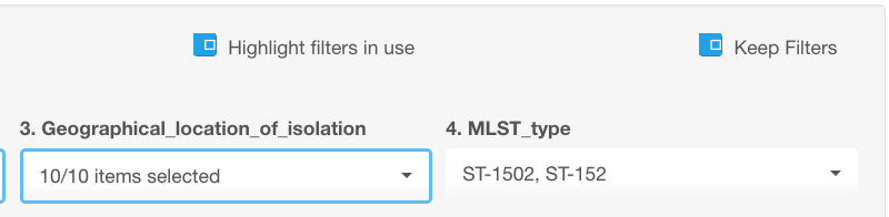
- If after that we go back and modify the selection in category filter #1, e.g., to include one additional value:

- We will see that the selection in the category field #3 has been reset to default (to include all available options):
Therefore, as you set your data filtering parameters, it is preferable to apply filters in the order of their appearance on the screen (this does not apply to the fields with continuous data, e.g., patient age).
If you wish to keep selected criteria for display, turn on the keep filter option:
Infographics field
There are 7 tabs in the Infographics field that provide different types of data visualization.
Overall, the infographics field has a general-to-specific structure. This layout facilitates an exploratory approach to your dataset. Meaning, the user doesn’t have to have a preconceived scientific question or target phenomena in mind that they want to investigate, but rather would like to methodically review all facets of their data. Following the organization of the analysis, inherent to the AMRcloud resource, by advancing through the infographics tabs left to right, will help users to form their scientific questions at the more general level of the analysis and proceed to refining and investigating it as they move towards visualization levels focusing on specific data.
- Tab Data structure allows viewing general metadata structure characteristics (proportions of entries with various characteristics, relationships between different data categories, data overlay with a map).
- Tab Organisms – displays a summary of representation of different species or groups of organisms in the dataset. It may be useful for an initial overview of the dataset and delineation of the further analysis strategy for different species and groups of organisms (e.g., Enterobaterales).
- Phenotypic resistance can be viewed and analyzed in three tabs: Antibiotic S/I/R Summary, Selected Antibiotic, and Associated Resistance, which are ordered by their level of data granularity starting from a broad overview moving towards more in-depth analysis. Using Infographics tools in that order would prompt the user to start with detecting the concern/interest areas at a big-picture level (general prevalence of resistance to various antimicrobials among different bacterial species, MIC trends, etc.). Then the user would proceed to drill down to unravel potential connections between various types of data: resistance phenotypes vs. metadata (demographic data, geographic distributions, diagnosis, therapy, any genetic or phenotypic properties of the pathogen strains, etc.), as well as associations between individual antibiotic resistance phenotypes (co-resistance, multidrug resistance).
- Described above types of analysis logically lead to the tab Markers, providing a convenient tool for investigating associations between resistant phenotypes and genetic antibiotic resistance determinants. It can also be used to analyze the correlation between all sorts of genetic markers and any type of metadata.
- Tab Compare – allows to create two groups with the desired set of parameters and then compare those groups against each other based on various data selected by the user. For example, one could create the first group as community-acquired cases and the second group- as nosocomial cases and then compare the prevalence of antimicrobial resistance, presence of different markers, or any metadata distribution between two groups.
The filtering from the Basic filters field applies to visualizations in all tabs
Drop-down lists included in the infographics field serve as controllers of what data is presented in a given graph and apply only to the tab they are listed under (unlike filters in the top portion of the screen that include/exclude data for all tabs).
After making the adjustments in the filter fields under the infographics, you need to press the Display button to apply the changes.
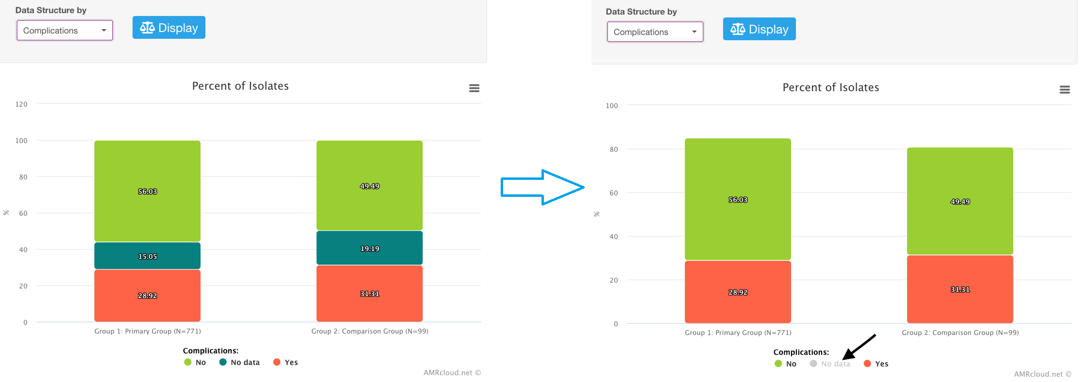
Histograms, pie charts, and area plots generated in various infographics fields of AMRcloud are interactive:
- Hovering over the graph brings a pop-up message showing the name of the data category and percentage of isolates with a given data value.
- You can change the categories displayed on the graph by clicking on their names in the legend for the corresponding graph. (This does not change relative percentages shown in the graph). E.g., you can hide cases with no data available from the view by clicking on the corresponding data category in the legend.
Understanding of basic connections between loaded data and data filtering/analysis options
As mentioned earlier, the names of the headers in your imported data table will be used as the names of the basic filters in the AMRcloud analysis module. When uploading the data, you are asked to mark some of your data fields as Parameters to filter (or Filtration Columns), while others as Markers. Both will be displayed as the Basic Filters for your data. The difference is that the data fields marked as Markers in your original data table will be additionally available for selection under the Markers tab in the Infographics field; this will make it easier to plot those genetic features against the phenotypes (especially SIR categories) as well as other metadata.
Another thing to consider, if you have data on multiple genetic determinants that are known to confer resistance to a certain class of antimicrobials, it may be convenient to group them under one category (see detailed instructions in the manual for data upload).