Detailed description of the types of analysis available in AMRcloud.
Below is the detailed description of the different types of analysis that can be performed in separate tabs of the Infographics field.
Data structure
Tab Data structure gives a general overview of metadata structure. These infographics will help you overlay and compare any type of metadata uploaded with your dataset; however, it does not include antibiotic susceptibility data, which is investigated in detail in the consequent tabs.
Following visualization tools are available under Data structure (sub-tabs):
Pie Chart
Pie Chart sub-tab — simple data distribution by the categories that can be picked from the drop-down list. The table under the graph shows the cumulative data that went into the displayed graph and can be exported in various formats (csv, Excel, pdf, …).
Plot by
Plot by sub-tab — shows data distribution in relation to different criteria set by controllers in this Infographics field:
- Field Plot — the category of data that will be displayed
- Field Group by — the categories in which the displayed data will be classified into.
Example. Distribution of isolates of different species by years

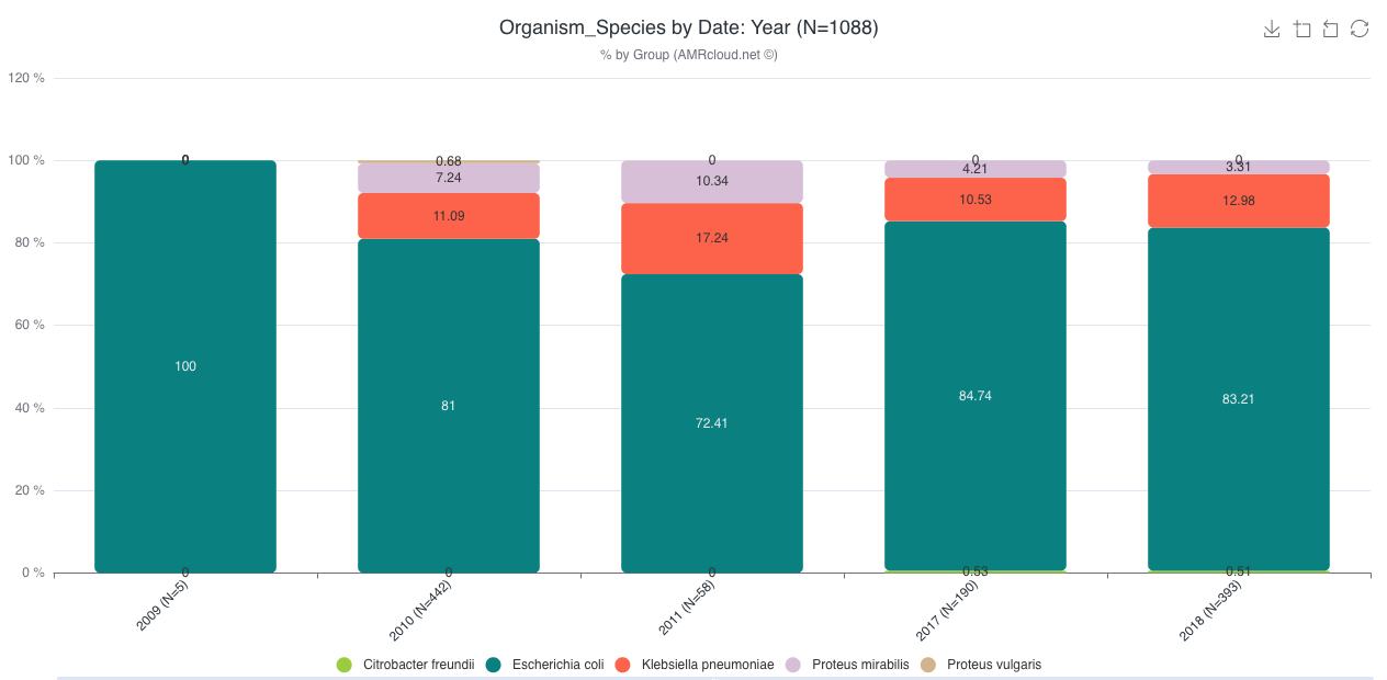
Table with cumulative data used to generate the graph is also available below.
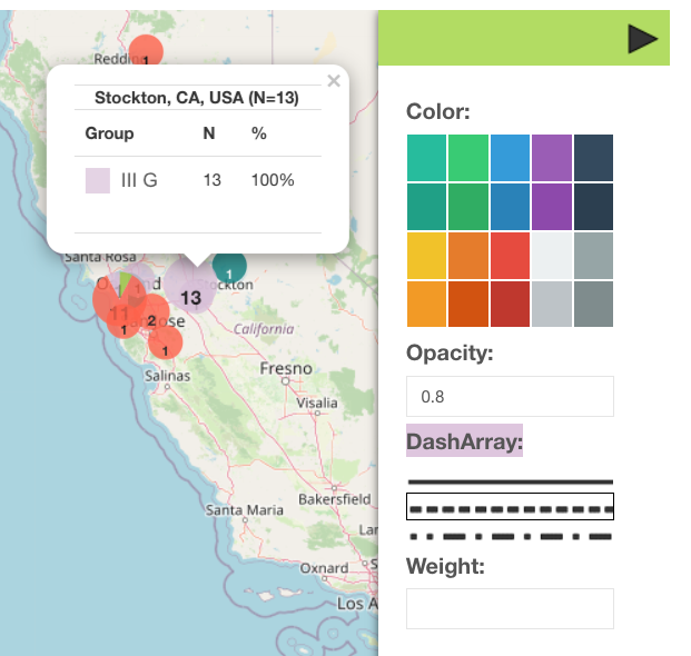
Map
Map sub-tab — allows a display of one data category at a time that is set by a drop-down filter.
- To include all data points on the screen, press
- To search for the location on the map, use
- You can apply markers or drawings by using the side panel on the map

- Various adjustments to the elements on the map are available via Style Editor
Organisms
Tab Organisms – displays a summary of representation of different species or groups of organisms in the dataset (or subset of data selected based on the filters in the Basic Filters filed).
Antibiotics S/I/R Summary
Tab Antibiotics S/I/R Summary displays the overview distribution of the isolates by susceptibility categories S/I/R (which are either entered by the user or calculated from provided by user MIC of Inhibition zone diameter values)
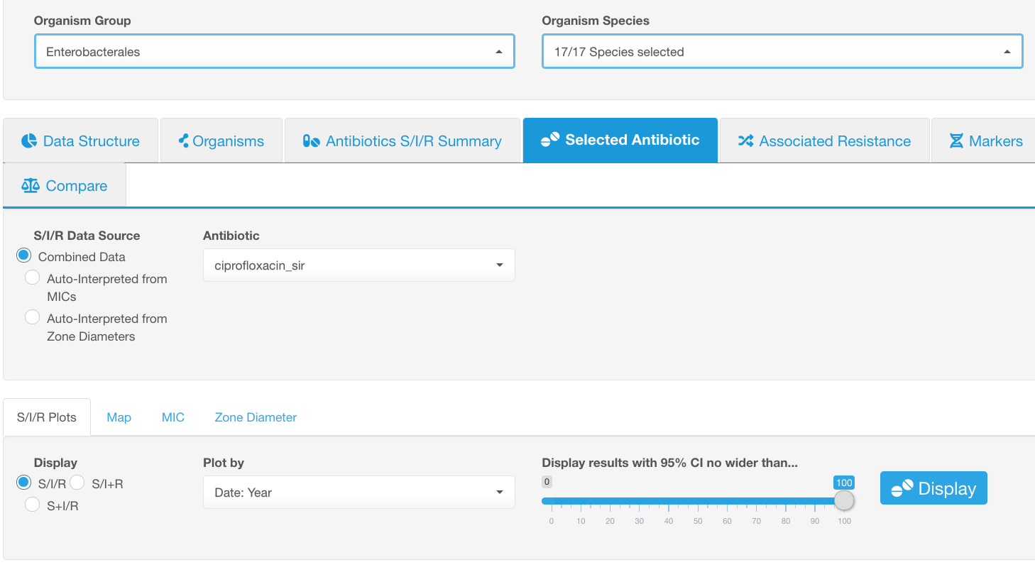
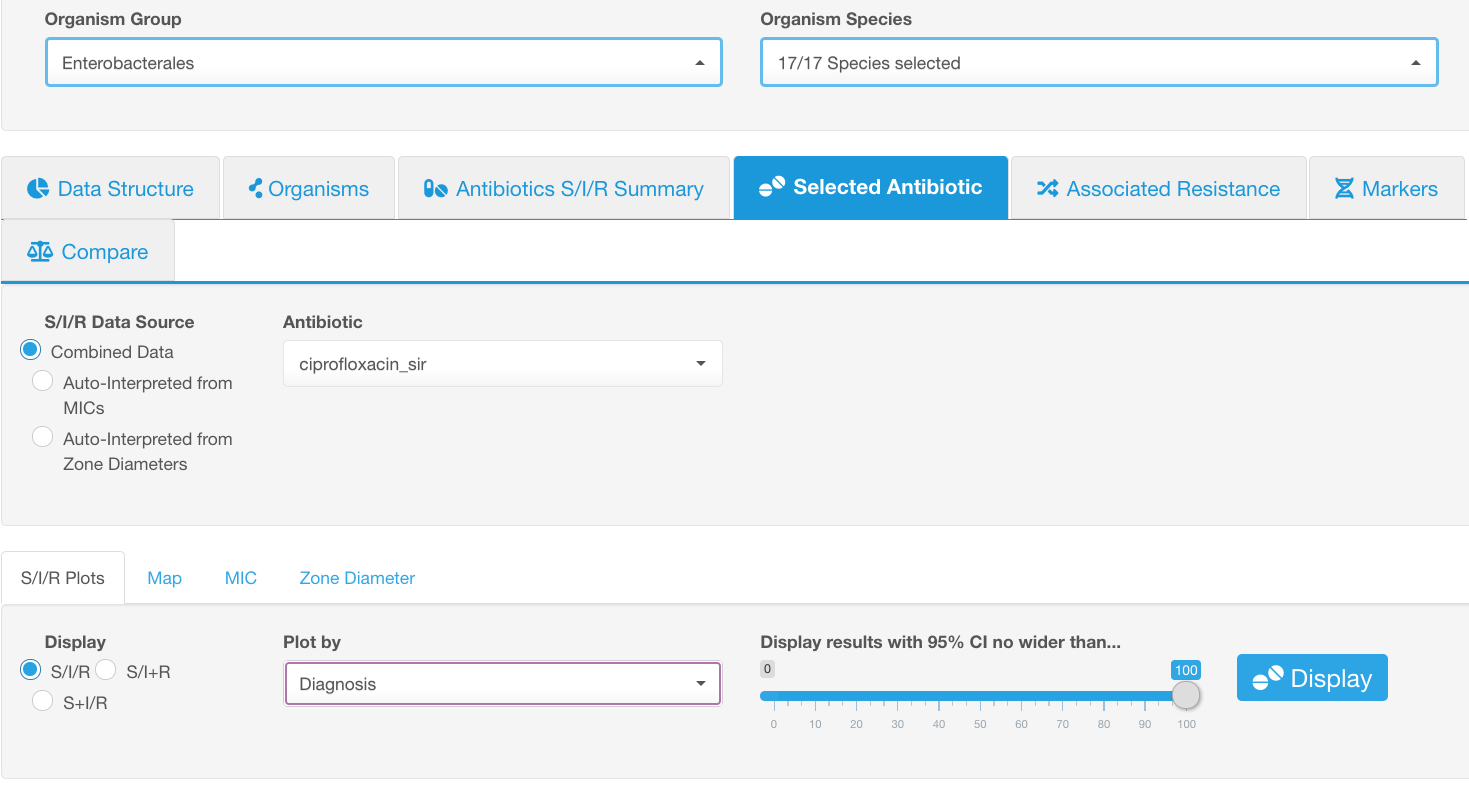
Only one organism group or species can be analyzed at once. Before clicking Display, select the Organism Group or Organism Species in the Basic Filters part of the window.
By default, the susceptibility categories are displayed for all tested antibiotics (for which the susceptibility criteria are available). You may further select a smaller group of antibiotics (or a single drug) for which you would like to view the S/I/R distributions using the Antibiotic drop-down list in the Plot sub-tab.
Below are the controllers of data view available under the Antibiotics S/I/R Summary infographics field:
- A user can choose to show combined data from both auto-interpreted MICs and Zone Diameters together or select one of them under the drop-down list S/I/R Data Source.
- S/I/R categories can be displayed separately or be combined as S/I+R or S+I/R under the drop-down list Display.
Selected Antibiotic
Tab Selected Antibiotic allows to visualize the association of S/I/R categories for each antibiotic with other various factors present in the dataset (e.g., year, genetic lineage, diagnosis, geographic location, etc.). The main goal of this data visualization is to expose the concealed connections between a pattern of antibiotic resistance and any type of provided metadata. This is also the place where you can see antimicrobial susceptibility data distribution by discrete MIC or zone diameter values.
Following controllers of data view are used to adjust data depiction throughout all sub-tabs of the Selected Antibiotic infographics field:
- A user can choose to show combined data from both auto-interpreted MICs and Zone Diameters together or select one of them under the drop-down list S/I/R Data Source.
- Antibiotic, for which the in-depth analysis is performed, can be selected in the Antibiotic drop-down list. The default selection is the first antibiotic in alphabetical order found in the dataset. Only one antibiotic can be chosen at a time.
Following sub-tabs are available under Selected Antibiotic:
S/I/R Plots
As you open S/I/R Plots, the first set of filters allows you to:
- switch between S/I/R individual categorical view and either S/I+R or S+I/R combined views
- adjust 95% CI display
- (most importantly) select the metadata type that will be used for differential analysis of the susceptibility data (viewing susceptibility data distribution based on different metadata categories) – set in the drop-down list Plot by.
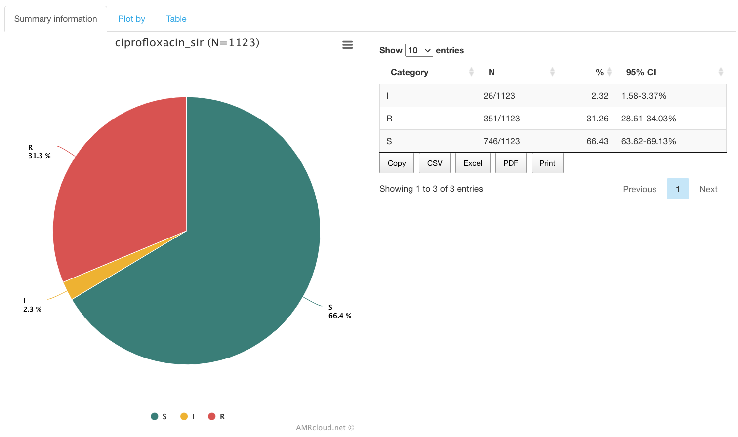
The Summary information infographic is displayed first by default and provides the S/I/R summary for the selected antibiotic. (Summary is not affected by the Plot by filter set above).
Example. Overall ciprofloxacin resistance of Enterobacterales.
Let’s say we would like to see the overall ciprofloxacin resistance of Enterobacterales present in the dataset.
Settings:
- Select the species or group of organisms for which resistance will be explored. Species or a group of organisms have to be selected for performing the tasks involving antimicrobial resistance phenotype interpretation (due to the species-specific nature of susceptibility breakpoints).
- Pick an antibiotic from the drop-down list, e.g., ciprofloxacin.
- Select the sub-tab S/I/R Plots.
- Select the infographics Summary information for the results
To proceed with viewing the distribution of antibiotic susceptibility categories (S/I/R) based on various data groups available in the dataset, click on infographics Plot by. Select the type of metadata you would like to use for grouping in the Plot by drop-down list in the level above.
Example. Prevalence of ciprofloxacin resistance in different infection types caused by members of Enterobacterales.
Let’s say we would like to see the prevalence of ciprofloxacin resistance in different infection types caused by members of Enterobacterales.
Settings:
Results:
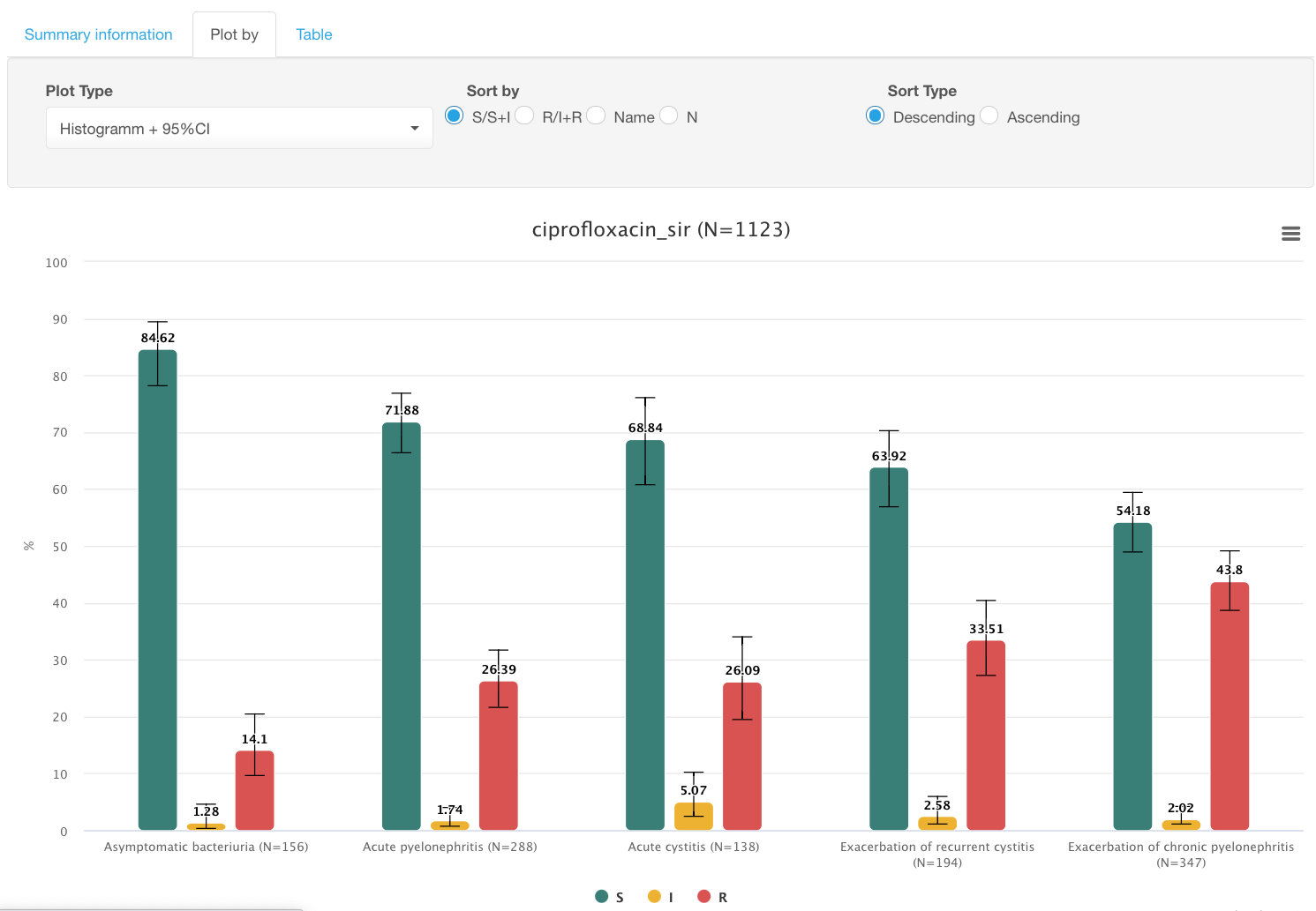
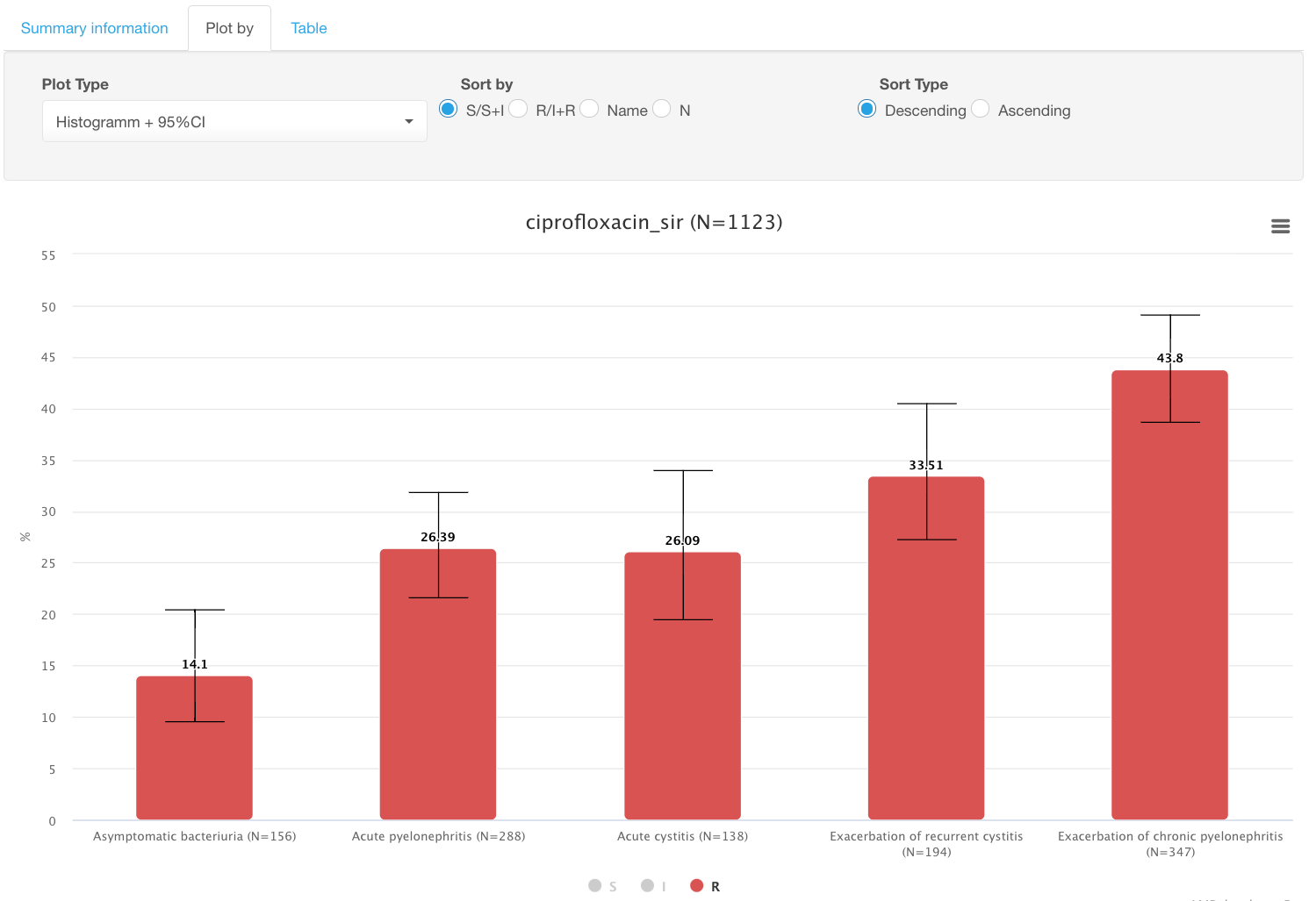
By clicking on colored circles with categories S/I/R under the graph, you can limit displayed categories. E.g., switch to only showing % of resistant isolates by deselecting S and I data:
The Table available under the last subtab of S/I/R plots shows the cumulative data that corresponds to the graph displayed in Plot by infographics.
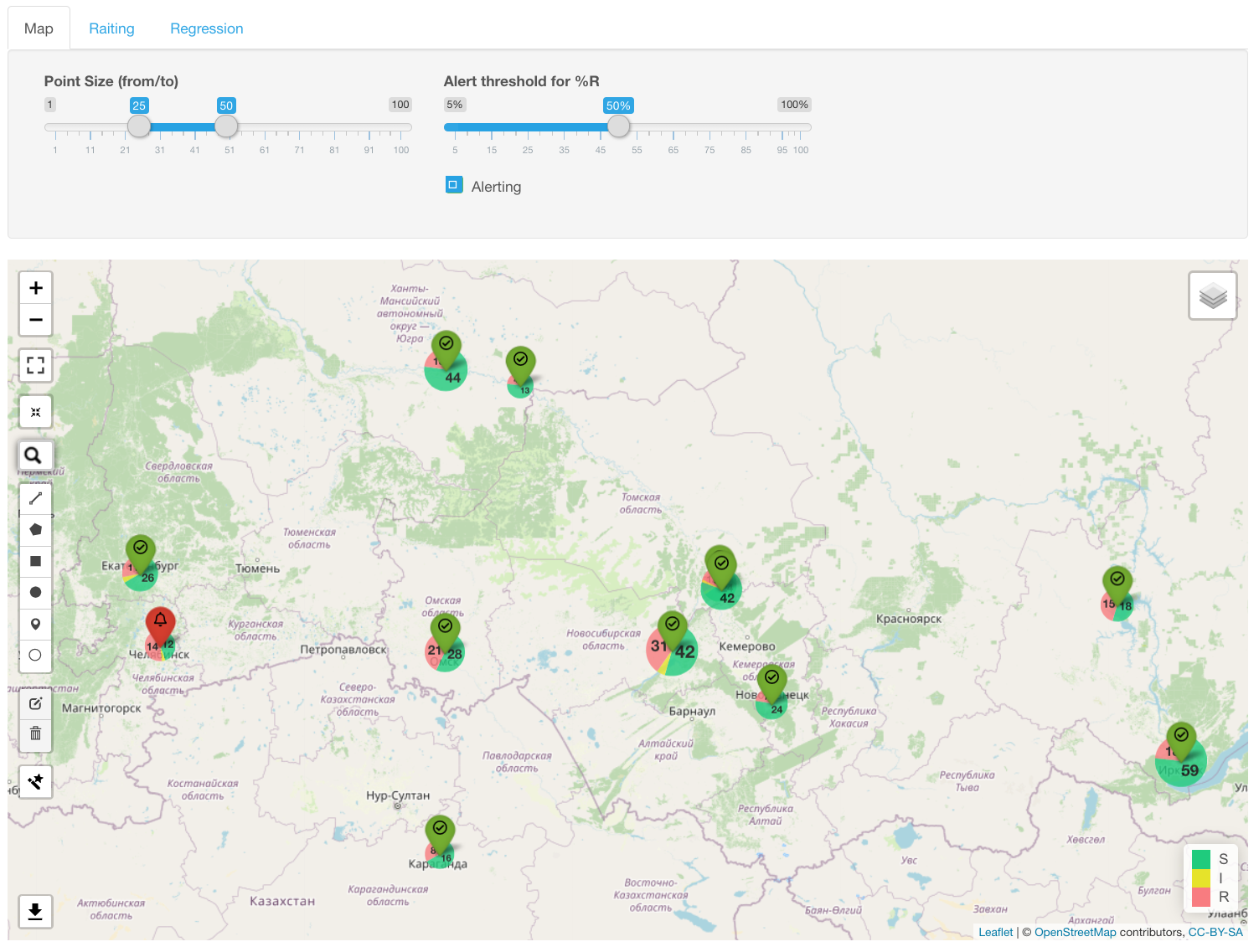
Map
The map with S/I/R data shown as a pie chart for each geographic location appears under Map infographics.
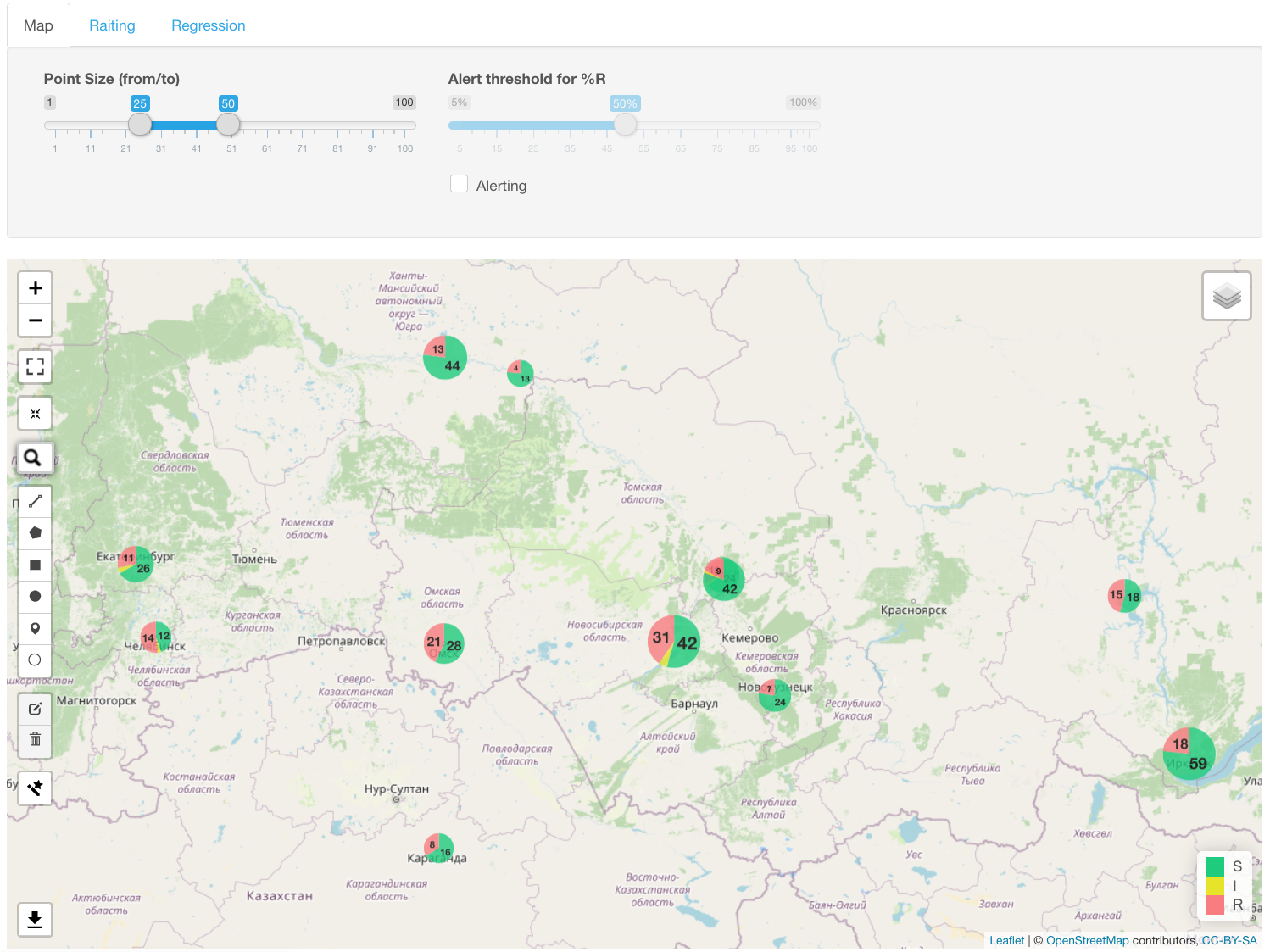
The diameter of each pie chart is proportional to the number of isolates. A left-click of the mouse on the diagram shows the geographic location name and absolute and relative number of samples.
You may set up an alert value to flag all locations with resistance prevalence above a certain threshold. Example: flag location with >=50% resistance to ciprofloxacin:
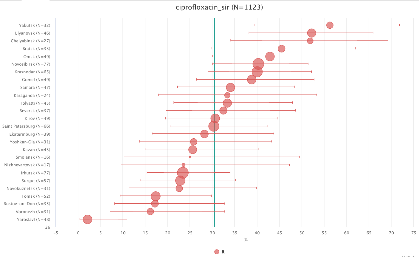
Infographics Rating displays the prevalence of the selected resistance type in all geographical loci and orders them according to their rate. Vertical line designates a median percentage of resistant isolates.
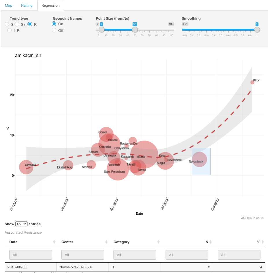
Regression analysis of phenotypic susceptibility trends for various geographic locations is available in the corresponding infographics Regression. The generated graph has time points plotted against the X-axis and percentage values for the selected susceptibility categories along the Y-axis.
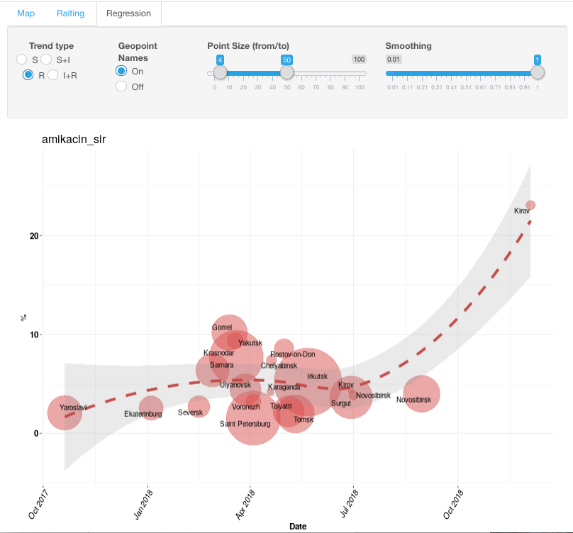
In the infographics settings, a user has the option to display various susceptibility phenotypes (S, S+I, R, I+R) as well as turn off and on the display of geographical names. Using the sliding scale, one may also adjust the size of circles and smoothing of the graph.
To see detailed information for specific geographic locations (particularly, the outlier from general trend), draw a box around values of interest with a left-click of a mouse.
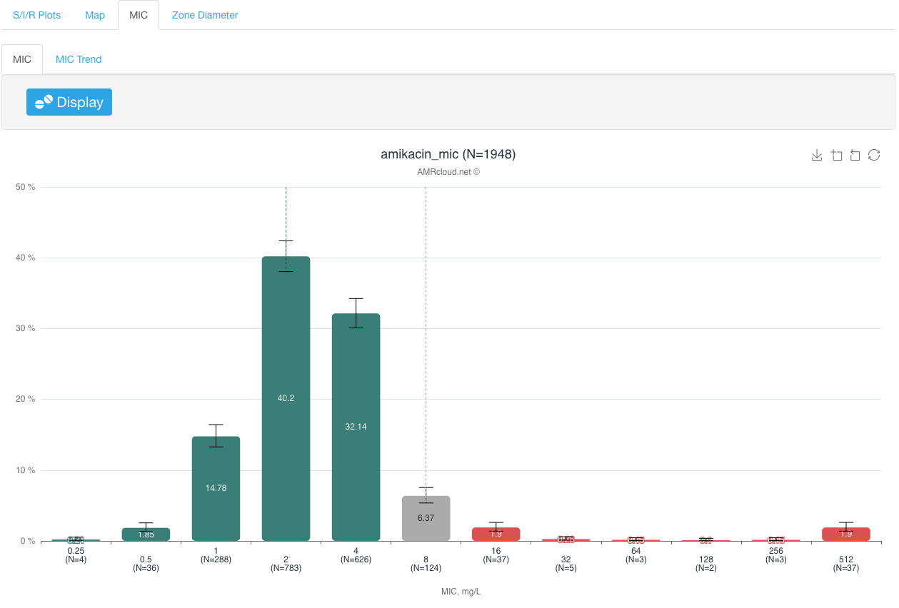
MIC
MIC sub-tab presents antimicrobial susceptibility data as a distribution by discrete MIC or zone diameter values.
Infographics MIC plots the number of isolates with each corresponding MIC value, as well as MIC 50 and MIC 90 values.
Interpretive criteria (CLSI or EUCAST) selected upon dataset upload are applied to color-code graph bars for different MIC values: red for resistant isolates, yellow for intermediate, and green for susceptible isolates. If no interpretation criteria are available for a given drug-bug combination, the data bars for the corresponding MIC values will appear grey. It is also possible to have only data bars corresponding to the certain MIC values colored grey- if instead of a single species, the organism group is selected in Basic Filters, and the interpretive criteria for different species (or different infection localizations) within the given group are different for the selected antibiotic.
Infographics MIC Trend plots the MIC trend to the specified antibiotic within a given time frame.
The generated graph has time points plotted along the X-axis and MIC values along the Y-axis. The size of the circle for each value corresponds to the number of isolates. Color-coding is the same as in the MIC Infographics.
Checking the flag MIC and adjusting the MIC xx% scale displays the trend of the compiled MIC values:
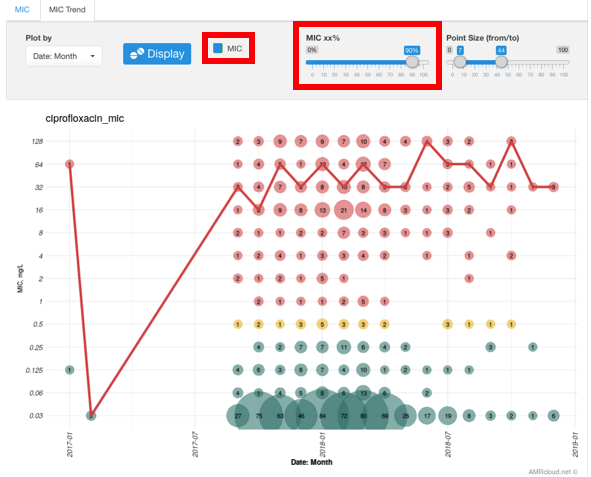
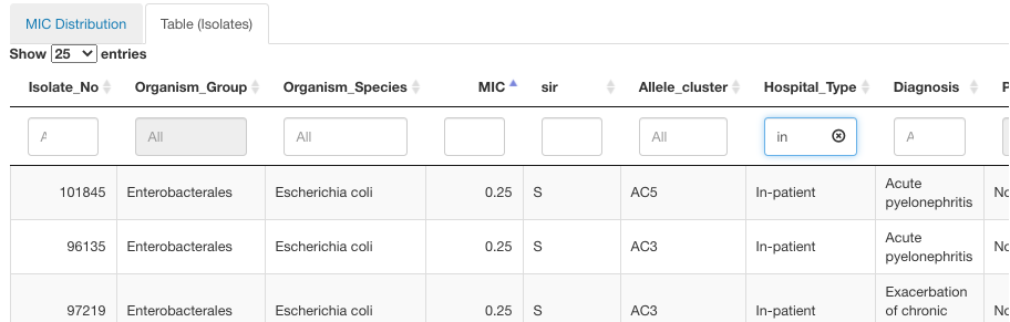
To see additional information for the specific MIC values in a given time frame, draw a box around values of interest with a left-click of a mouse and press the button Get Info under the graph. Displayed below information will display the S/I/R distribution for the datapoints encompassed by your selection in the histogram. The table will also include the isolate-level details. The isolates table can be further filtered based on any of the data columns by typing in the value at the top of the column or sorted in ascending/descending order.
Zone Diameter
Zone Diameter sub-tab performs the same function as the MIC sub-tab described above, but for the analysis of antibiotic zone diameters distribution and trends. Similarly, this sub-tab contains Infographics Zone Diameter and Zone Diameter Trend.
Associated Resistance
Tab Associated Resistance – is a perfect tool for discovering associations between different antibiotic resistance phenotypes. This analysis utility quantifies the number of isolates that are assigned to the category resistant based on applied susceptibility interpretation criteria.
Following infographics sub-tabs are available under Associated Resistance:
Coresistance
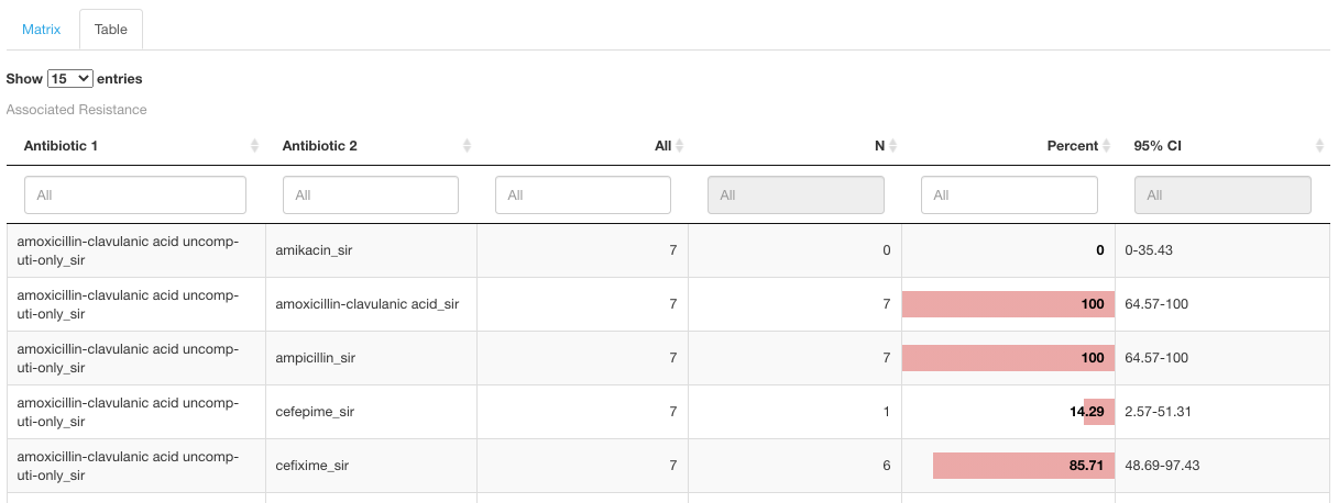
The Coresistance sub-tab demonstrated the data on associated resistance as a matrix, where the values in the intersection of two antibiotics show the percentage of cases when resistance to one drug correlates with the resistance to another antimicrobial. Applied heatmap (Matrix infographics) represents the higher percentage of correlation as a brighter red color of the cell.
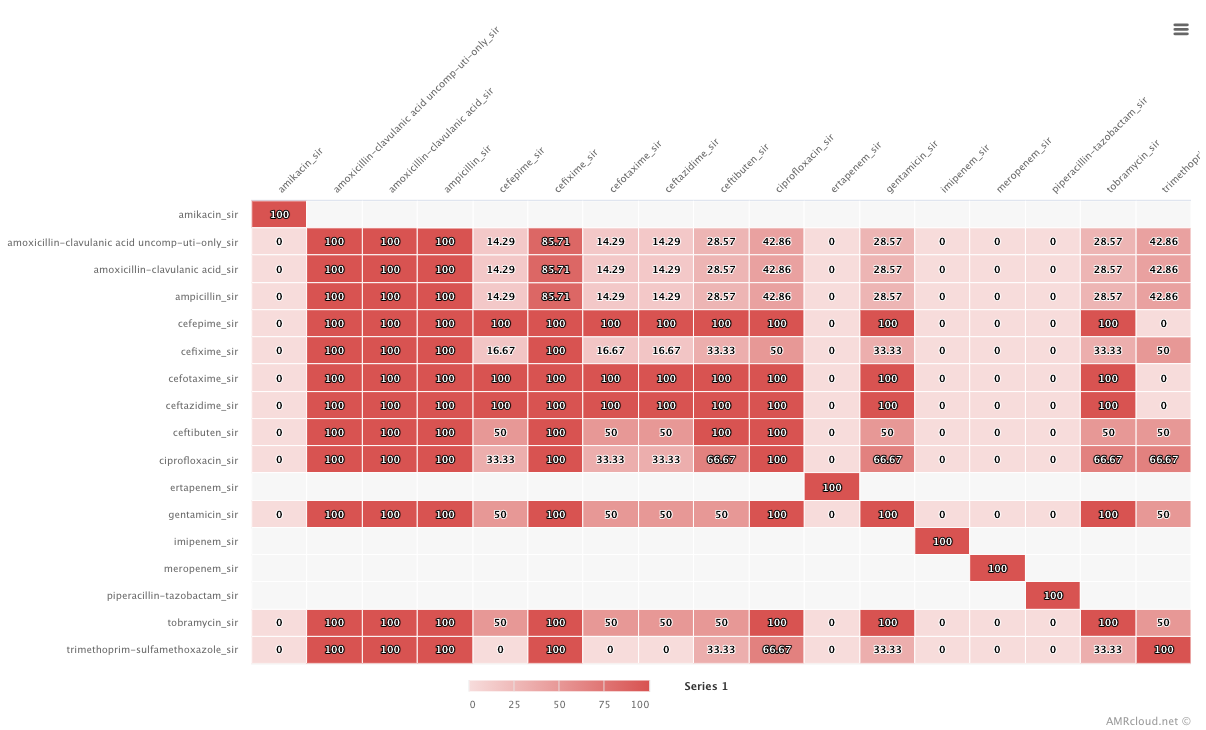
The selection of antibiotics is defaulted to displaying all drugs present in the dataset, but the user may restrict the displayed antimicrobials by using the drop-down list under the Coresistance sub-tab.
The same data is also available in Table view under the corresponding tab Table:
Multiple Resistance
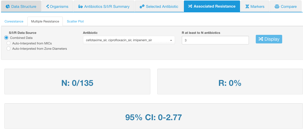
Multiple Resistance sub-tab calculates the number of isolates that displays correlated resistance against the selected antibiotics.
Select 2 or more antibiotics from the drop-down list Antibiotic to see how many isolates possess simultaneous resistance to those antibiotics.
In the R at least to N antibiotics, set the value to match the number of the selected antibiotics if you would like to see what portion of isolates is resistant to all of those antibiotics.
Example
If we selected 3 antibiotics: cefotaxime, ciprofloxacin, and imipenem - and then set the number of correlated drug resistance to 3 - it means we will see the number of isolates simultaneously resistant to all 3 drugs - cefotaxime, ciprofloxacin, and imipenem. In the example below, none of the isolates possessed such a combination of resistant phenotypes:
If we set R at least to N antibiotics to 2, this would mean that we would see the number of isolates that are simultaneously resistant to any 2 antibiotics from the selected list (cefotaxime, ciprofloxacin, and imipenem):
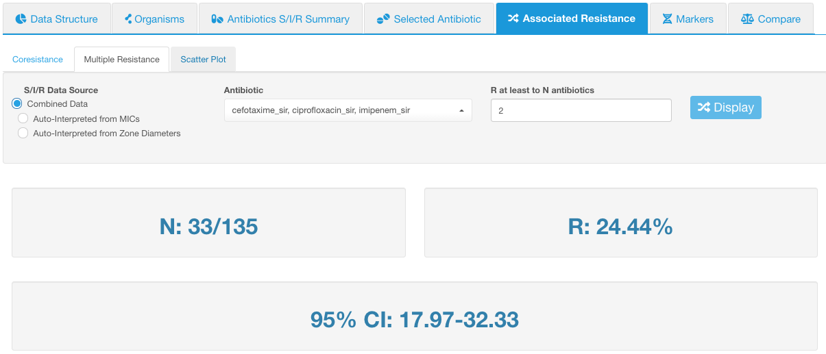
In our example, there are 33 isolates that have such resistance combination out of 135 total tested isolates (value N).
- Value N shows the absolute number of isolates that have the configured resistance combination, displayed in relation to the number of total tested isolates.
- Value R shows the relative number of isolates resistant to the selected antibiotics (percentage equivalent of the N value).
- 95% CI is the 95% confidence interval of the relative number of isolates with multiple resistance.
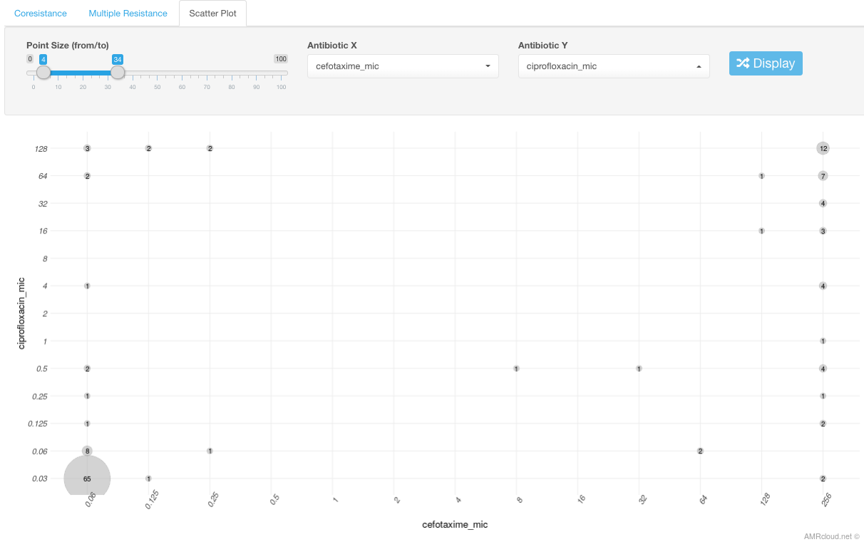
Scatter Plot
Scatter Plot sub-tab shows scatter plot of MIC values for 2 selected antibiotics. Select any 2 antibiotics using the drop-down list under this subtab.
The number displayed in the intersection between MIC values for 2 different antibiotics corresponds to the number of isolates with such MIC values combination. The circle size is proportional to the number of the isolates with given MIC values and can be adjusted using the scale Point size.
Example
In the example below, we have 12 isolates with ciprofloxacin MIC 128 mg/L and cefotaxime MIC of 256 mg/L.
Markers
Tab Markers – can be used for all sorts of genetic markers that you would like to overlay with any type of metadata or antibiotic susceptibility data; the latter is most convenient for investigating correlations between resistant phenotype and antibiotic resistance determinants.
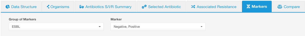
Select a group of markers using the Group of Markers drop-down list under the Markers tab. Group of Markers could be any column in your dataset that you marked as Markers while loading the data, and any distinct values in the corresponding column would be considered as individual markers.
By default, all values under that group will be displayed, but you can use the Marker drop-down list to limit the displayed values. E.g., below we selected the group of markers - ESBL, and left all possible values to display (in this case only 2 values - positive and negative).
Following infographics sub-tabs are available under Markers:
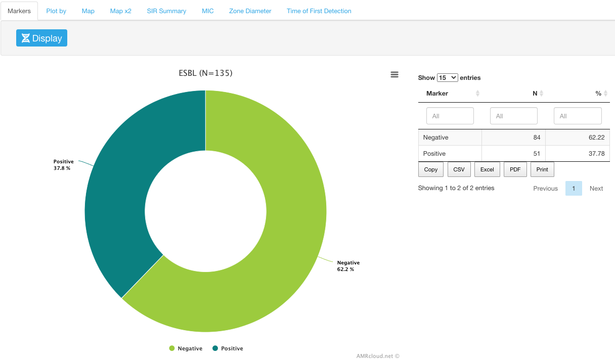
Markers
Markers sub-tab shows a circular diagram representing a summary of the values available under the selected Group of Markers, i.e., percentage of isolates with each marker value.
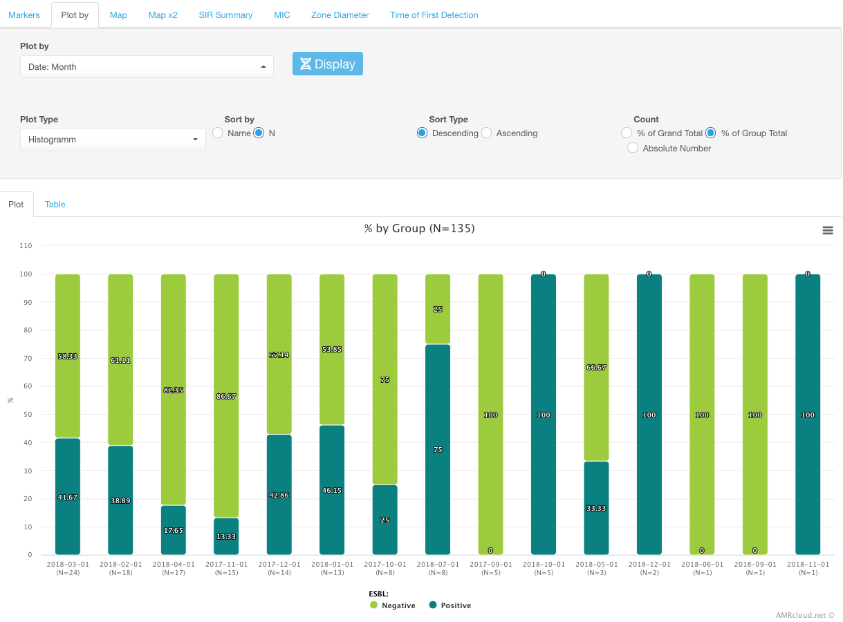
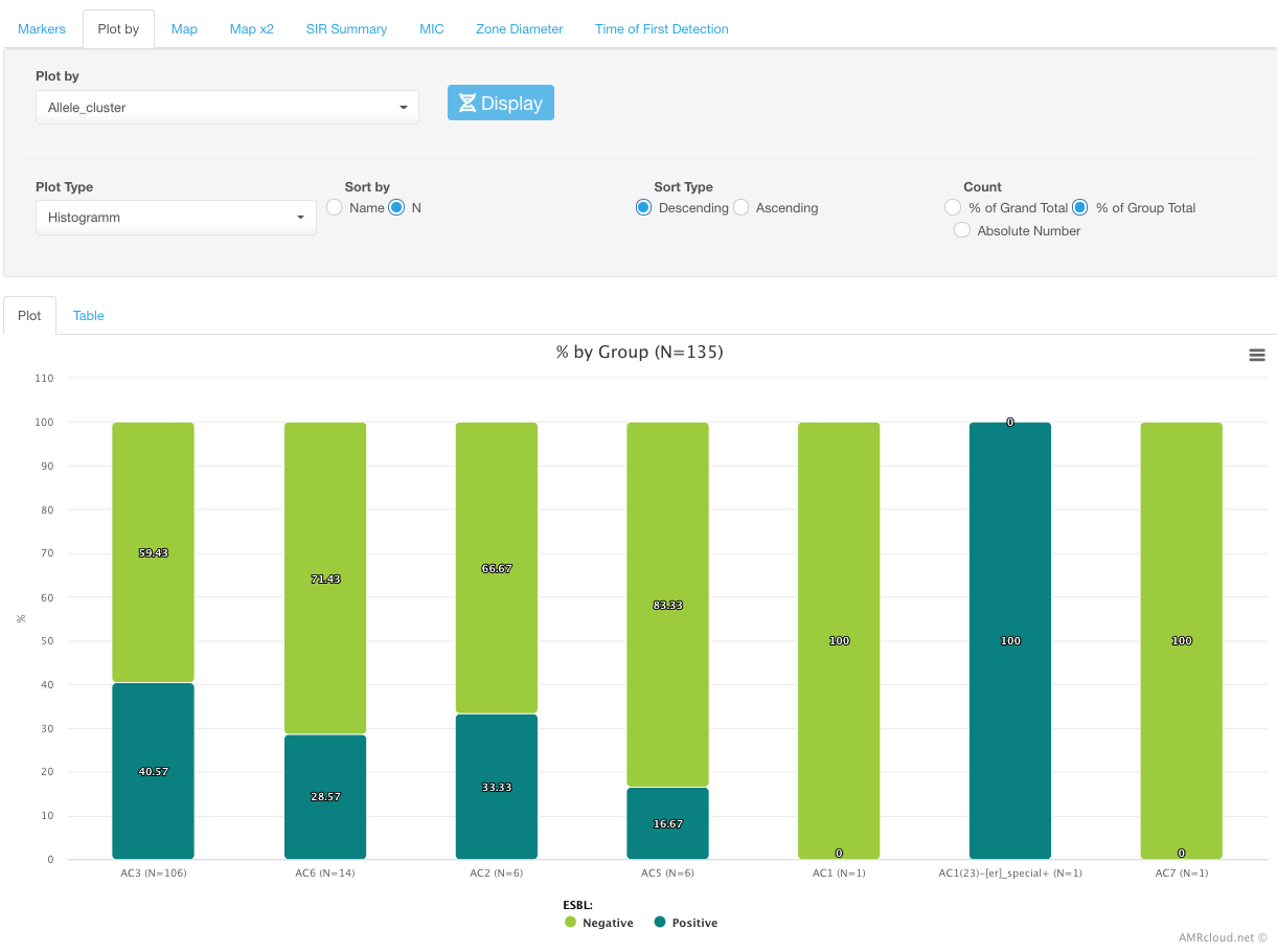
Plot by
Plot by sub-tab is a convenient tool to investigate the correlations between various markers and any metadata that is present in your dataset.
To select the type of data for the analysis categories, use the Plot by drop-down menu.
Example
Distribution of ESBL markers by month:
Or by allele clusters (genotyping groups):
Map
The Map sub-tab is used to overlay the number of isolates with a given marker on the geographical map.
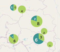
The diameter of the circle for each geographic location is proportional to the number of isolates with the selected marker. The size of circles can be adjusted by dragging the Point Size pointers.
Clicking on the circles will bring a pop-up message showing the name of the geographic location and the number of the isolates.
Map x2
Map x2 sub-tab differs from the Map sub-tab in the ability to display side by side two maps: one with markers and another one- with a selected antibiotic’s SIR distribution by geographical location.
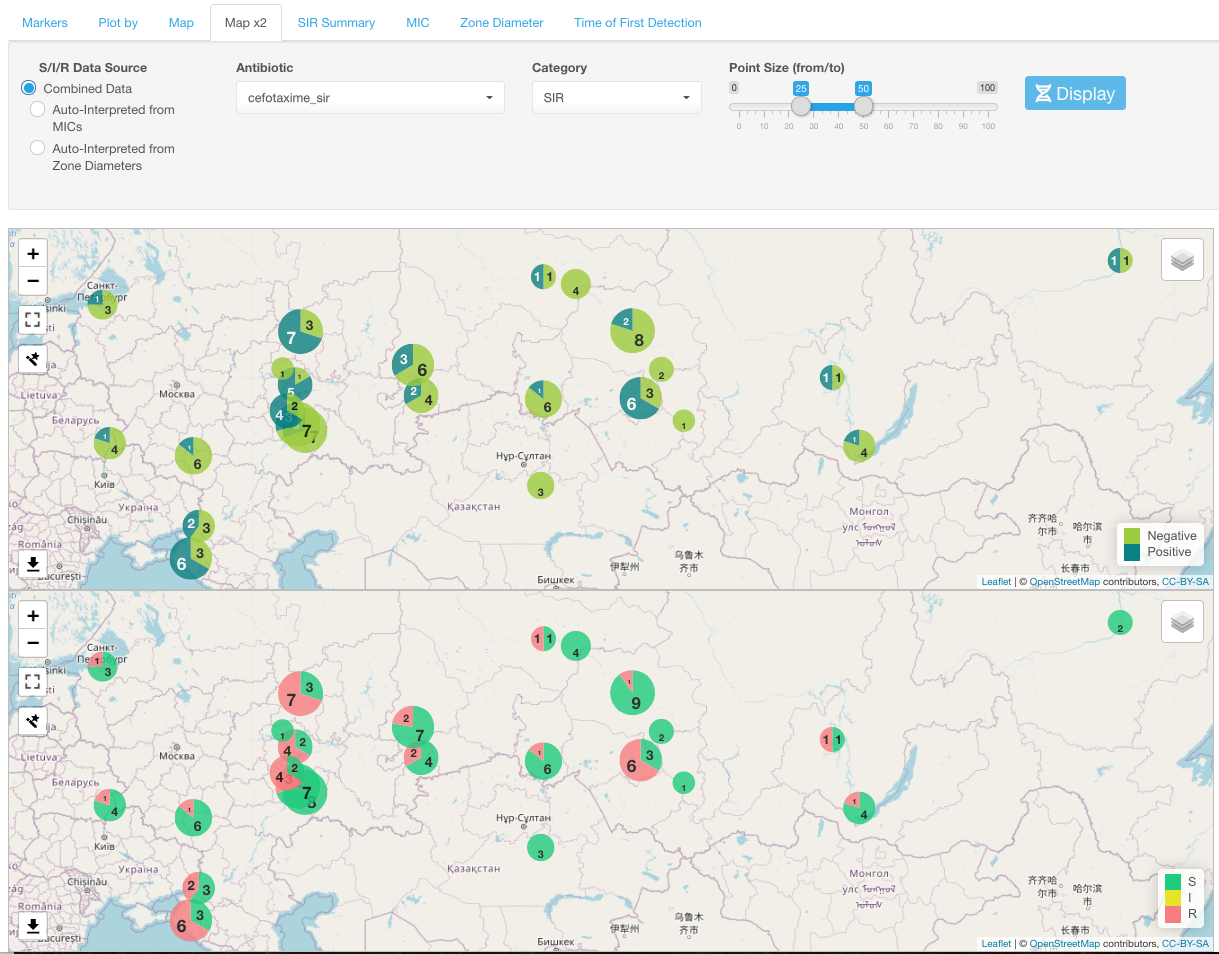
Select one antibiotic for the SIR display using the Antibiotic drop-down menu under the Map x2 sub-tab.
You can change how SIR categories are displayed on the map using the Category drop-down list and select either of the following: SIR, S+I, R, R+I.
Any movement or zooming in one map view is automatically applied to another map.
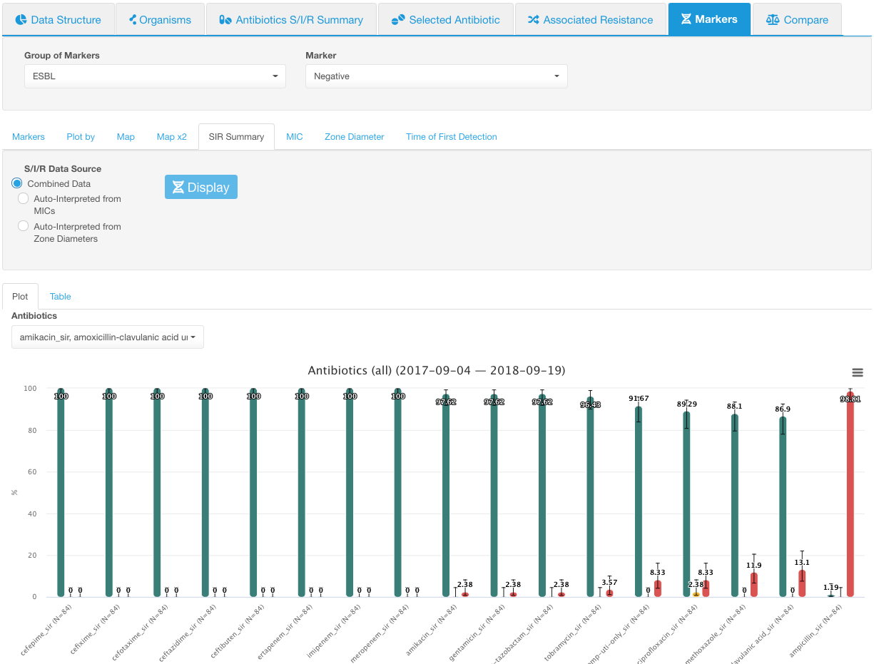
SIR Summary
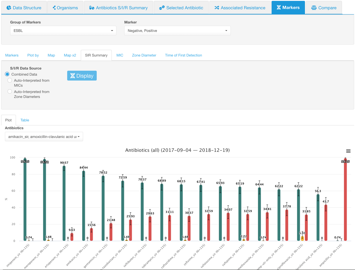
SIR Summary sub-tab allows visualizing the information on susceptibility categories (SIR) among the isolates with a selected marker(s).
The most useful way to review the data would be to select one marker at a time in the Marker drop-down list and look at SIR category distributions for a given marker before moving to the next marker. If all markers are selected, the SIR distribution infographic displays the values for all isolates that have the given marker group values and doesn’t show the difference between different markers.
The SIR plot has the percentage of isolates plotted on the Y-axis and SIR categories for the selected antibiotics plotted on the X-axis. The color of the graph bar corresponds to the susceptibility profile:

Example
Below is an example with the ESBL marker group:
- Both possible marker values are selected. SIR distribution for all antibiotics is shown:
-
Only the Positive ESBL marker is selected. SIR distribution for all antibiotics is shown:
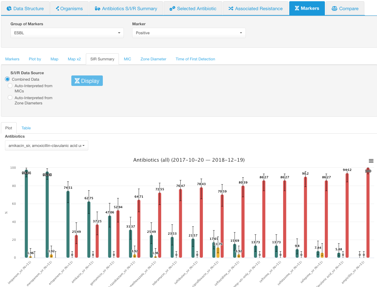
SIR summary. Positive ESBL -
Only the Negative ESBL marker is selected. SIR distribution for all antibiotics is shown:
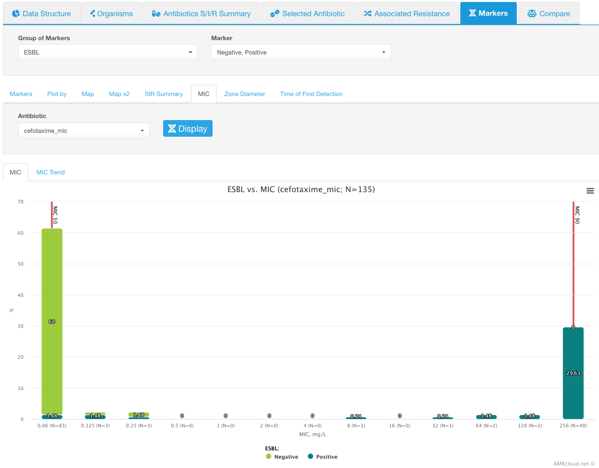
MIC
MIC sub-tab demonstrates the distribution of the selected markers in relation to MIC values of the selected antibiotic. For this analysis, you may have all or only certain markers selected. However, you would need to select only one antibiotic at a time to display the MIC distributions.
Infographics MIC shows the histogram distribution with each MIC value of the selected antimicrobial plotted along the X-axis and the percentage of isolates plotted along the Y-axis. The color within each bar indicates the markers, with the height of the block reflective of the proportion of the isolates with a given marker. MIC 50 and MIC 90 values are marked with red vertical lines.
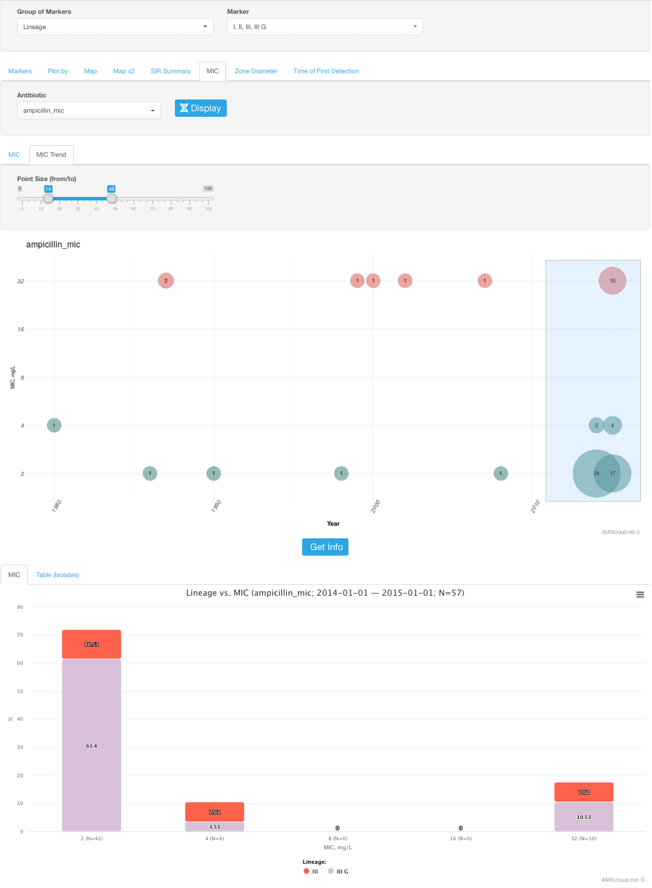
Infographics MIC Trend has dates plotted along the X-axis and MIC values along the Y-axis. Data is displayed for the isolates with the selected marker(s).
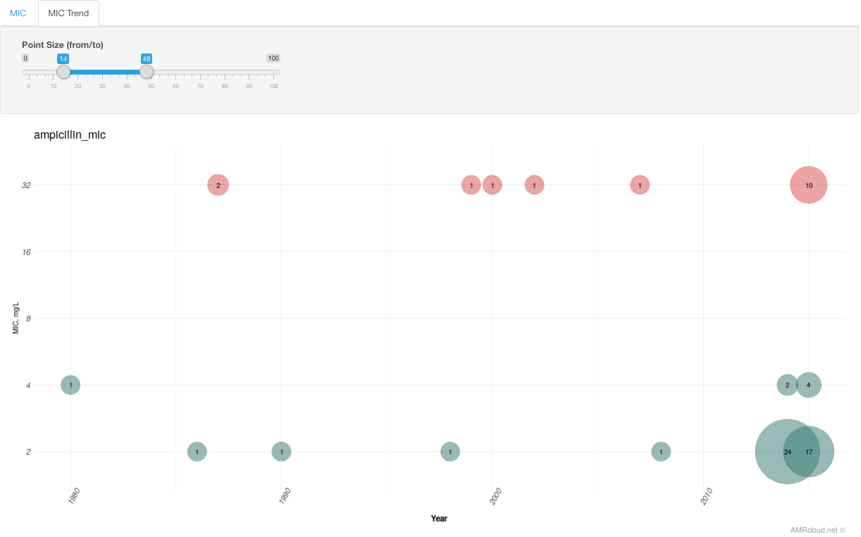
The color of circles corresponds to the susceptibility category and circle size - to the number of isolates.
You can select the circles on the graph for which you want to get more information (by drawing a box around them) and click the button Get Info. The data displayed below will have information on the isolates included in those data points: their MIC values distribution in the MIC tab and metadata - in the Table (Isolates) tab. MIC tab here could be helpful if you would like to see a distribution of MICs in relation to the markers selected for the analysis upstream.
Zone Diameter
Zone Diameter sub-tab pretty much does the same visualization as the MIC subtab, but for AST data available as zone diameters. As with MIC, you may have all or only certain markers selected, but you would need to select only one antibiotic at a time.
Infographics Zone Diameter shows the histogram distribution with each Zone Diameter value of the selected antimicrobial plotted along the X-axis and percentage of isolates plotted along the Y-axis. The color within each bar indicates the markers, with the height of the block reflective of the proportion of the isolates with a given marker.
Infographics Zone Diameter Trend displays dates plotted along the X-axis and Zone Diameter values along the Y-axis for the isolates with the selected above marker(s).
You can draw a box around the data points for which you want to see more information and click the button Get Info. The data displayed below in the Zone Diameter tab will have Zone Diameter distribution for the selection in relation to the markers selected for the analysis upstream.
The Table (Isolates) tab contains the metadata for the isolates included in selection on the Zone Diameter Trend graph.
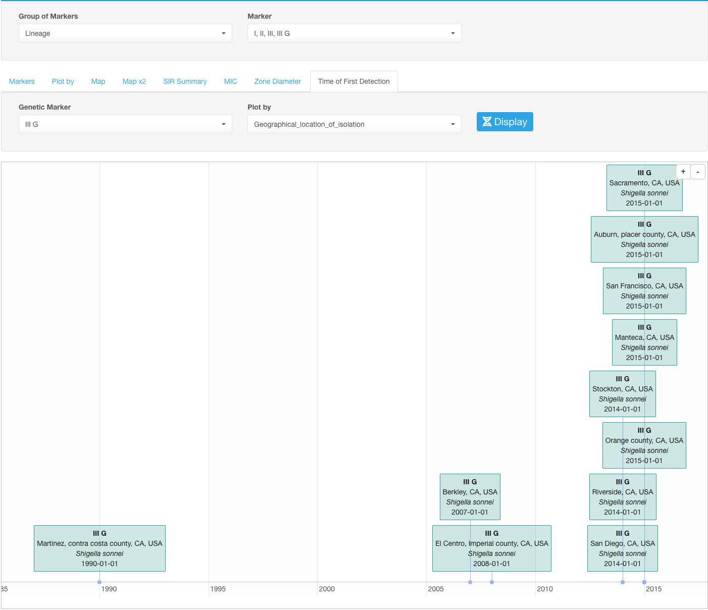
Time of First Detection
Time of First Detection sub-tab provides visualization of the date of the first detection of a certain marker.
Select the marker under the drop-down list Genetic Marker.
You can alter what information about the first detection case is displayed on the timeline by selecting different parameters in the drop-down list Plot by. In the case if dates of the first detection are different based on the value of the parameter selected in Plot by, you’ll see multiple date marks on the timeline.
Example
If we select an IIIG lineage of Shigella sonnei in our example dataset as a marker and set the Plot by to geographical location, we will see the dates when this marker was detected in all geographical locations:
Compare
Tab Compare is used to compare two groups defined by the user based on the variety of different parameters (various metadata categories, resistance, presence of markers, etc.).
A user utilizes the filters to define what parameters do the isolates need to meet in order to be included in one or another group. Group #1 is set using the Basic filters field, and Group #2 is defined using the Filters for Comparison field under the Compare tab - both fields have the same set of filters set at default values at a start, that could be later modified accordingly to define the two comparison groups. E.g., in order to create Group #1, you could filter isolates in the Basic filters field based on prior antibiotics use and only select patients with a recent history of antibiotics prescription. Now, to create Group #2, one could filter the isolates for the second group to only include isolates from patients with no recent antibiotics therapy.
The organism group and/or organism species selected by the user for Group #1 will be automatically populated for Group #2 (but not the other way around). Only the group filter is automatically populated.
This applies to the selected organism group and species. So if you are planning to restrict the comparison to a particular organism group/species (will be necessary for S/I/R category analysis; see below), it is helpful to set the organism specifics under the Group #1 parameters before applying filters to Group #2 to avoid having to redo your Group #2 filtering. Alternatively, you can always reapply your Group #2 filters if you had to change organism group/species after both Groups have been already defined.
After the two groups were defined, proceed to select the parameters that you want to use as a basis for the comparison of the two groups.
Data structure
Data structure sub-tab: you can use any data categories in your dataset as the parameters for the comparison of two groups. Those will be listed in the drop-down list Data Structure by.
The top part of the infographics will contain data visualization of your comparison as a bar graph. As with other bar graphs in AMRcloud infographics, you can hide data categories from the view by clicking on them in the legend to the graph. E.g., hiding cases with no data available on complications:
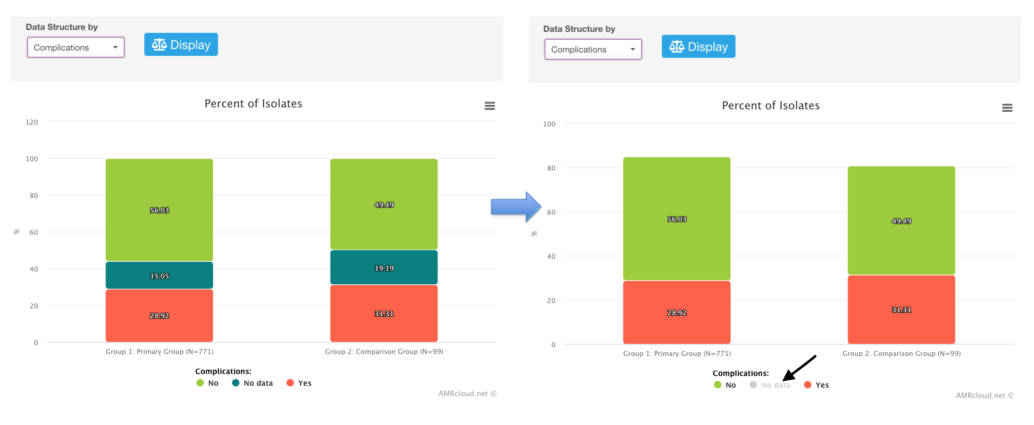
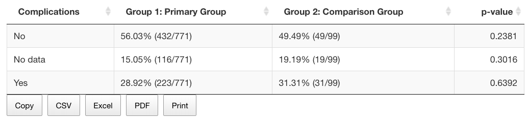
Below the graph, you can see the table showing the row values and percentages for all data categories, as well as the p-value for the statistical significance level (exact Fisher test for each category).
SIR
S/I/R sub-tab: If you would like to compare the antibiotic susceptibility phenotype between two selected groups, make sure to first select the same organism group (or species) in Group #1 (will be applied to both Groups automatically).
Determinants
Determinants sub-tab allows you to show the distribution of various genetic markers (values in the dataset labeled by the user as Markers) between two comparison groups. (The values listed in the Determinants sub-tab are the same as in the Markers tab, but the structure of the infographic is more geared towards the comparison of markers between two groups).